目次
二軸グラフを作成する
Axes オブジェクトの twinx メソッドを使います。
Example
source code
from matplotlib import pyplot

x = [1, 2, 3, 4, 5]
values1 = [14.5, 8.3, 6.1, 9.9, 12.7]
values2 = [0.5, 14.5, 0, 0, 19.5]

fig = pyplot.figure()
ax1 = fig.add_subplot(1, 1, 1)
ax2 = ax1.twinx()

ax1.plot(x, values1, color="brown")
ax2.bar(x, values2, width=0.4, color="cornflowerblue")

pyplot.savefig("two_y_axis.png")
result

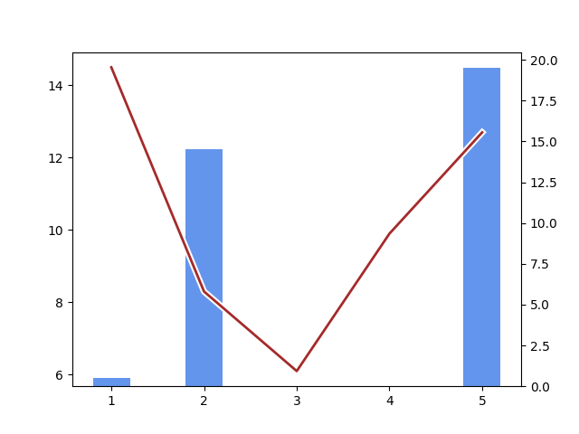
グラフの表示順を変更する
もし手前に表示して欲しいグラフが、もう一方のグラフに隠れてしまった場合は、
Axes オブジェクトの set_zorder と set_frame_on メソッドを使います。
set_zorder で指定する数値は、「手前に表示したい方の値」を「奥に表示する方の値」より大きくします。
Example
source code
from matplotlib import pyplot
from matplotlib.patheffects import withStroke

x = [1, 2, 3, 4, 5]
values1 = [14.5, 8.3, 6.1, 9.9, 12.7]
values2 = [0.5, 14.5, 0, 0, 19.5]

fig = pyplot.figure()
ax1 = fig.add_subplot(1, 1, 1)
ax2 = ax1.twinx()

effects = [withStroke(linewidth=5, foreground="white")]
ax1.plot(x, values1, linewidth=2,
                     color="brown",
                     path_effects=effects)
ax1.set_zorder(2)
ax1.set_frame_on(False)

ax2.bar(x, values2, width=0.4, color="cornflowerblue")
ax2.set_zorder(1)

pyplot.savefig("two_y_axis_zorder.png")
result
グラフが重ならないように表示する
Axes オブジェクトの
set_ylim メソッドで、
bottom に元々の値より小さい値を指定することで、グラフは上側に寄ります。
また、top に元々の値より大きい値を指定することで、グラフは下側に寄ります。
これらを組み合わせることで、ひとつの図でグラフが重ならないように表示することができます。
下記の Example source code は、折れ線グラフと棒グラフのケースになっています。
Example
source code
import numpy
from matplotlib import pyplot

x = [1, 2, 3, 4, 5]
values1 = [14.5, 8.3, 6.1, 9.9, 12.7]
values2 = [0.5, 14.5, 0, 0, 19.5]

fig = pyplot.figure()
ax1 = fig.add_subplot(1, 1, 1)
ax2 = ax1.twinx()

# y-axis ratio (ax1 : ax2 = yratio : 1)
yratio = 2

# ax1 settings
ax1.plot(x, values1, color="brown")
ax1.grid(linestyle=":", color="silver")

(bottom, top) = ax1.get_ylim()
new_bottom = bottom - (top - bottom) / yratio
ax1.set_ylim(bottom=new_bottom)

ticks = ax1.get_yticks()
indices = numpy.where((ticks >= bottom) & (ticks <= top))
ax1.set_yticks(ticks[indices])

# ax2 settings
ax2.bar(x, values2, width=0.4, color="cornflowerblue")
ax2.grid(axis="y", linestyle="--", color="lightseagreen")
ax2.set_axisbelow(True)

(bottom, top) = ax2.get_ylim()
new_top = top * (yratio + 1)
ax2.set_ylim(top=new_top)

ticks = ax2.get_yticks()
indices = numpy.where(ticks <= top)
ax2.set_yticks(ticks[indices])

pyplot.savefig("two_y_axis_ylim.png")
result
出典
- 気象庁ホームページ「過去の気象データ・ダウンロード」
兵庫県姫路市の平均気温、降水量の合計、期間: 2018年3月15日から2018年3月19日
使用箇所: このページの「二軸グラフを作成する」、「グラフの表示順を変更する」