目次
折れ線グラフを作成する (1)
折れ線グラフ (line chart) を作成するためには、
matplotlib.pyplot モジュールの plot 関数を使います。
plot 関数で指定する引数には、 まず可変長引数が有り、 x, y, fmt を組み合わせたものを指定します。
ただし、x, fmt については省略が可能です。 更に x を省略すると、x に range(len(y)) を指定した時と同様な結果になります。 また、x, y, fmt はキーワード引数として指定することはできません。
- x: x座標の値を表すシーケンス、または data に対する任意のキー
- y: y座標の値を表すシーケンス、または data に対する任意のキー
- fmt: 簡易的な書式設定を表す文字列で、色 (1文字)、マーカーの種類、線の種類のみ指定できる
オプション引数であるキーワード専用引数と可変長キーワード引数については、
data,
color,
linestyle,
linewidth,
marker,
markeredgecolor,
markeredgewidth,
markerfacecolor,
markersize
などが有ります。
- data: ラベル付きデータ (辞書型など)
- color (c): 線の色
- linestyle (ls): 線の種類
- linewidth (lw): 線の太さ
- marker: マーカーの種類
- markeredgecolor (mec): マーカーの縁の色
- markeredgewidth (mew): マーカーの縁の太さ
- markerfacecolor (mfc): マーカーの塗りつぶしの色
- markersize (ms): マーカーの大きさ
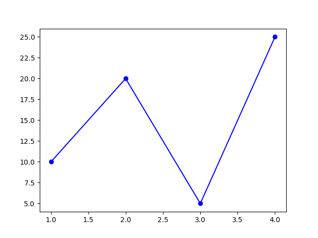
Example
source code
from matplotlib import pyplot

x = [1, 2, 3, 4]
y = [10, 20, 5, 25]

fmt = "bo-"
pyplot.plot(x, y, fmt)

pyplot.savefig("line_chart.png")
result
折れ線グラフを作成する (2)
Axes オブジェクトの plot メソッドを使うことでも、折れ線グラフを作成することができます。
Example
source code
from matplotlib import pyplot

x = [1, 2, 3, 4]
y = [10, 20, 5, 25]

fig = pyplot.figure()
ax = fig.add_subplot(1, 1, 1)

fmt = "bo-"
ax.plot(x, y, fmt)

pyplot.savefig("line_chart.png")
result
「折れ線グラフを作成する (1)」と同様。
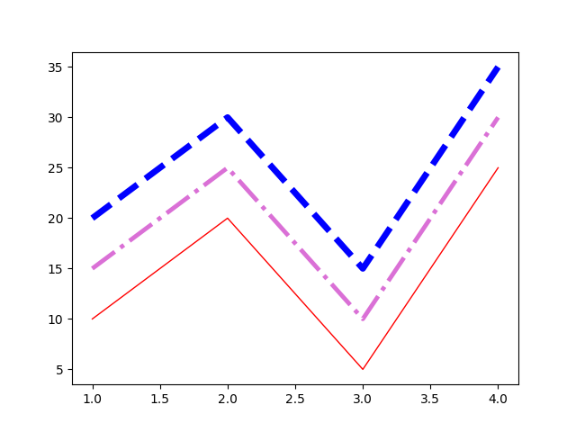
線の書式を変更する
下記のいずれかの方法で、線の書式を変更することができます。
plotメソッドを使う時に、任意のプロパティをキーワード引数として指定するmatplotlib.pyplotモジュールのsetp関数で、 「plotメソッドで取得したLine2Dオブジェクト」と、 任意のプロパティをキーワード引数として指定する- 「
plotメソッドで取得したLine2Dオブジェクト」の任意のメソッドを使うset_color: 線の色set_linestyle: 線の種類set_linewidth: 線の太さ
Example
source code
from matplotlib import pyplot

data = {"x": [1, 2, 3, 4],
        "y1": [10, 20, 5, 25],
        "y2": [15, 25, 10, 30],
        "y3": [20, 30, 15, 35]}

fig = pyplot.figure()
ax = fig.add_subplot(1, 1, 1)

ax.plot("x", "y1", "", data=data,
                       color="r",
                       linestyle="-",
                       linewidth=1.0)

lines = ax.plot("x", "y2", "", data=data)
pyplot.setp(lines[0], c="orchid",
                      ls="-.",
                      lw=3.5)

lines = ax.plot("x", "y3", "", data=data)
lines[0].set_color("#0000ff")
lines[0].set_linestyle("dashed")
lines[0].set_linewidth(5.0)

pyplot.savefig("line_chart_linestyle.png")
result
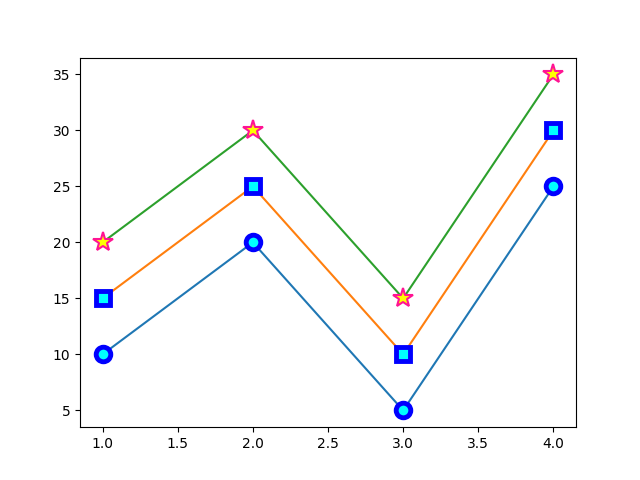
マーカーの書式を変更する
下記のいずれかの方法で、マーカーの書式を変更することができます。
plotメソッドを使う時に、任意のプロパティをキーワード引数として指定するmatplotlib.pyplotモジュールのsetp関数で、 「plotメソッドで取得したLine2Dオブジェクト」と、 任意のプロパティをキーワード引数として指定する- 「
plotメソッドで取得したLine2Dオブジェクト」の任意のメソッドを使うset_marker: マーカーの種類set_markeredgecolor: マーカーの縁の色set_markeredgewidth: マーカーの縁の幅set_markerfacecolor: マーカー塗りつぶしの色set_markersize: マーカーの大きさ
Example
source code
from matplotlib import pyplot

data = {"x": [1, 2, 3, 4],
        "y1": [10, 20, 5, 25],
        "y2": [15, 25, 10, 30],
        "y3": [20, 30, 15, 35]}

fig = pyplot.figure()
ax = fig.add_subplot(1, 1, 1)

ax.plot("x", "y1", "", data=data,
                       marker="o",
                       markeredgecolor="b",
                       markeredgewidth=3.5,
                       markerfacecolor="cyan",
                       markersize=10.5)

lines = ax.plot("x", "y2", "", data=data)
pyplot.setp(lines[0], marker="s",
                      mec="b",
                      mew=3.5,
                      mfc="cyan",
                      ms=10.5)

lines = ax.plot("x", "y3", "", data=data)
lines[0].set_marker("*")
lines[0].set_markeredgecolor("deeppink")
lines[0].set_markeredgewidth(1.5)
lines[0].set_markerfacecolor("#ffff00")
lines[0].set_markersize(14.5)

pyplot.savefig("line_chart_marker.png")
result
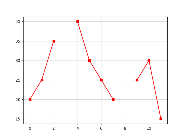
折れ線グラフを途切れさせる
「Y軸用のデータ」に NaN があると、折れ線グラフを途切れさせることができます。
Example
source code
import math
import numpy
from matplotlib import pyplot

y = [20, 25, 35, math.nan, 40, 30, 25, 20, numpy.nan, 25, 30, 15]

fig = pyplot.figure()
ax = fig.add_subplot(1, 1, 1)
ax.plot(y, "rs-")
ax.grid(color="lightgray")

pyplot.savefig("line_chart_nan.png")
result
参考リンク
- Pyplot tutorial — Matplotlib 3.1.1 documentation
- matplotlib.pyplot.plot — Matplotlib 3.1.1 documentation
- matplotlib.pyplot.subplot — Matplotlib 3.1.1 documentation
- matplotlib.axes.Axes.plot — Matplotlib 3.1.1 documentation
- matplotlib.lines.Line2D — Matplotlib 3.1.1 documentation
- matplotlib.colors — Matplotlib 3.1.1 documentation
- matplotlib.markers — Matplotlib 3.1.1 documentation
- Nan Test — Matplotlib 3.1.1 documentation