目次
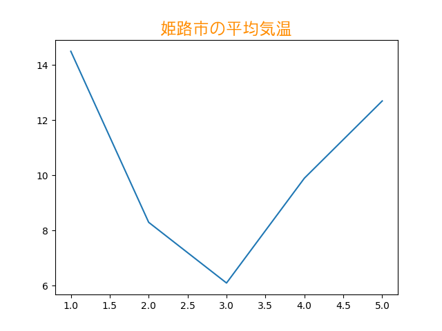
グラフのタイトルを表示する
Axes オブジェクトの
set_title メソッドを使います。
この時 kwargs を指定することで、タイトルの書式を変更することができます。
fontfamily でフォントの種類、
fontsize でフォントの大きさ、
color で文字の色を変更することができます。
日本語を表示したい場合は、fontfamily で日本語対応フォント ("MS Gothic" や "Ume Gothic" など) を指定してください。
Example のソースコードは「梅フォント」を指定しています。
「梅フォント」がインストールされていない環境では、他のフォント ("MS Gothic" など) を指定してみてください。
Example
source code
from matplotlib import pyplot

title = u"姫路市の平均気温"
xdata = [1, 2, 3, 4, 5]
ydata = [14.5, 8.3, 6.1, 9.9, 12.7]

fig = pyplot.figure()
ax = fig.add_subplot(1, 1, 1)
ax.set_title(title, fontfamily="Ume Gothic",
                    fontsize="xx-large",
                    color="darkorange")
ax.plot(xdata, ydata)
pyplot.savefig("chart_elements_title.png")
result
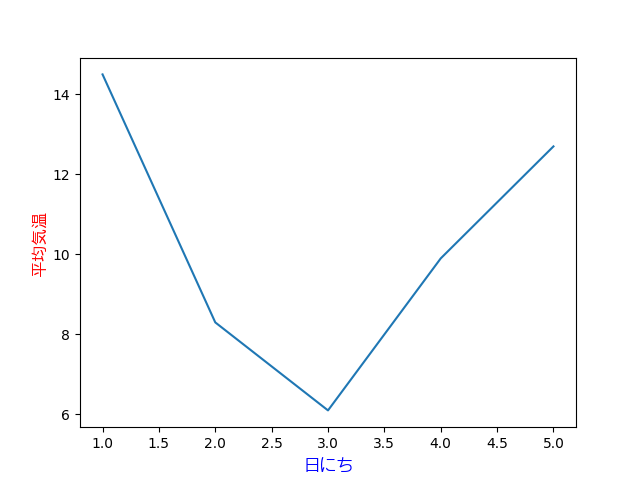
軸用のラベルを表示する
X軸用のラベルを表示したい場合は、Axes オブジェクトの
set_xlabel メソッドを使います。
Y軸用のラベルについては、Axes オブジェクトの
set_ylabel メソッドを使います。
それぞれのメソッドについて、kwargs を指定することで、ラベルの書式を変更することができます。
fontfamily でフォントの種類、
fontsize でフォントの大きさ、
color で文字の色を変更することができます。
日本語を表示したい場合は、fontfamily で日本語対応フォント ("MS Gothic" や "Ume Gothic" など) を指定してください。
Example
source code
from matplotlib import pyplot

xlabel = u"日にち"
ylabel = u"平均気温"
xdata = [1, 2, 3, 4, 5]
ydata = [14.5, 8.3, 6.1, 9.9, 12.7]

fig = pyplot.figure()
ax = fig.add_subplot(1, 1, 1)
ax.plot(xdata, ydata)

ax.set_xlabel(xlabel, fontfamily="Ume Gothic",
                      fontsize="large",
                      color="blue")
ax.set_ylabel(ylabel, fontfamily="Ume Gothic",
                      fontsize="large",
                      color="red")

pyplot.savefig("chart_elements_lebel.png")
result
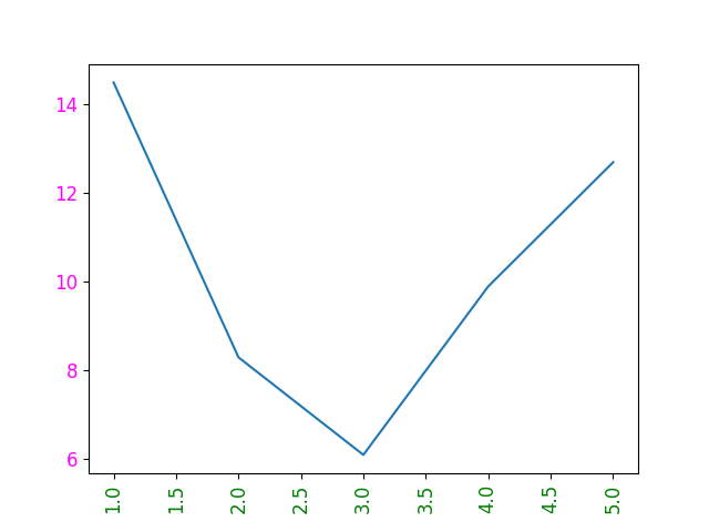
目盛り用のラベルを設定する
Axes オブジェクトの tick_params メソッドを使います。
labelsize でラベルの文字の大きさ、
labelcolor でラベルの色を変更することができます。
また、labelrotation でラベルの文字を回転することができます。
Example
source code
from matplotlib import pyplot

xdata = [1, 2, 3, 4, 5]
ydata = [14.5, 8.3, 6.1, 9.9, 12.7]

fig = pyplot.figure()
ax = fig.add_subplot(1, 1, 1)
ax.plot(xdata, ydata)

ax.tick_params("x", labelsize="large",
                    labelcolor="green",
                    labelrotation=90.0)
ax.tick_params("y", labelsize="large",
                    labelcolor="magenta")

pyplot.savefig("chart_elements_tick_params.png")
result
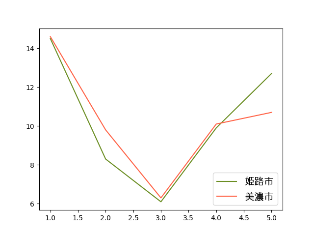
凡例を表示する
Axes オブジェクトの legend メソッドを使います。
あらかじめ、plot などで label の値を設定しておくと、
legend の引数を指定しなくて済みます。
凡例の表示位置を変更したい場合は、loc の値を指定します。
値の詳細は Matplotlib documentation の「matplotlib.axes.Axes.legend」を参照してください。
フォントの設定をしたい場合は、prop に matplotlib.font_manager.FontProperties インスタンスを指定します。
日本語を表示したい場合は、family パラメータに日本語対応フォント ("MS Gothic" や "Ume Gothic" など) を指定してください。
Example
source code
from matplotlib import pyplot
from matplotlib.font_manager import FontProperties

xdata = [1, 2, 3, 4, 5]
ydata1 = [14.5, 8.3, 6.1, 9.9, 12.7]
ydata2 = [14.6, 9.8, 6.3, 10.1, 10.7]

fig = pyplot.figure()
ax = fig.add_subplot(1, 1, 1)

ax.plot(xdata, ydata1, label=u"姫路市",
                       color="olivedrab")
ax.plot(xdata, ydata2, label=u"美濃市",
                       color="tomato")

ax.legend(loc="lower right",
          prop=FontProperties("Ume Gothic", size="x-large"))

pyplot.savefig("chart_elements_legend.png")
result
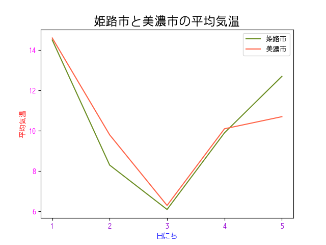
フォントをまとめて設定する
matplotlib.pyplot.rcParams["font.family"] にフォント名を代入することで、フォントをまとめて設定することができます。
Example
source code
from matplotlib import pyplot
from matplotlib.ticker import MultipleLocator

pyplot.rcParams["font.family"] = "Ume Gothic"

title = u"姫路市と美濃市の平均気温"
xlabel = u"日にち"
ylabel = u"平均気温"

xdata = [1, 2, 3, 4, 5]
ydata1 = [14.5, 8.3, 6.1, 9.9, 12.7]
ydata2 = [14.6, 9.8, 6.3, 10.1, 10.7]

fig = pyplot.figure()
ax = fig.add_subplot(1, 1, 1)
ax.set_title(title, fontsize="xx-large")

ax.plot(xdata, ydata1, label=u"姫路市",
                       color="olivedrab")
ax.plot(xdata, ydata2, label=u"美濃市",
                       color="tomato")

ax.set_xlabel(xlabel, color="blue")
ax.tick_params("x", labelcolor="darkviolet")
ax.xaxis.set_major_locator(MultipleLocator(1))

ax.set_ylabel(ylabel, color="red")
ax.tick_params("y", labelcolor="magenta")

ax.legend()

pyplot.savefig("chart_elements_rc_font_family.png")
result
出典
- 気象庁ホームページ「過去の気象データ・ダウンロード」
兵庫県姫路市の平均気温、期間: 2018年3月15日から2018年3月19日
使用箇所: このページのすべての Example source code, result - 気象庁ホームページ「過去の気象データ・ダウンロード」
岐阜県美濃市の平均気温、期間: 2018年3月15日から2018年3月19日
使用箇所: このページの「凡例を表示する」、「フォントをまとめて設定する」
参考リンク
- matplotlib.axes.Axes.set_title — Matplotlib 3.0.3 documentation
- matplotlib.axes.Axes.set_xlabel — Matplotlib 3.0.3 documentation
- matplotlib.axes.Axes.set_ylabel — Matplotlib 3.0.3 documentation
- matplotlib.axes.Axes.tick_params — Matplotlib 3.0.3 documentation
- matplotlib.axes.Axes.text — Matplotlib 3.0.3 documentation
- matplotlib.axes.Axes.legend — Matplotlib 3.0.3 documentation
- Customizing matplotlib — Matplotlib 2.0.2 documentation # Dynamic rc settings